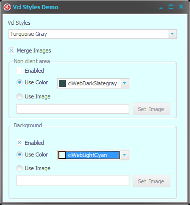
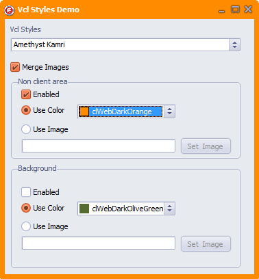
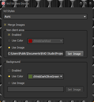
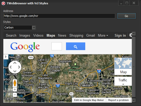
This post is just for announce which the VCL Styles Utils project now supports Delphi XE3.
Category Archives: VCL Styles
Using custom colors in the TDBGrid columns with vcl styles enabled
The TDBGrid component allows you to customize the colors of the columns and fonts used to draw the data.
Unfortunately if you uses the vcl styles all these customizations are lost
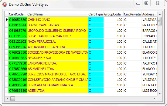
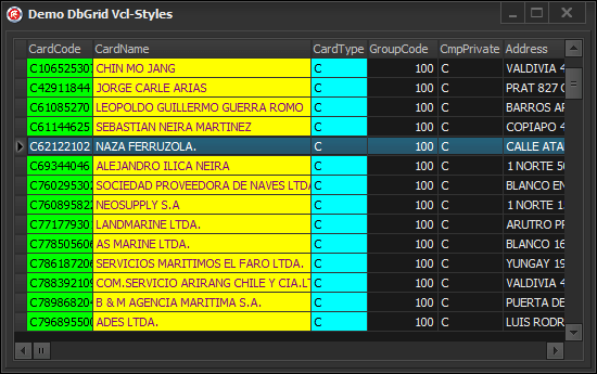
This issue is caused because the TCustomDBGrid.DrawCell method ignores the custom colors of the columns when the vcl styles are enabled. So the solution is patch this method to allow use the proper colors. After of this you will get a result like so.
I just uploaded this patch as part of the vcl styles utils project. To use it you must add the Vcl.Styles.DbGrid unit to the uses part of your form after of the Vcl.DBGrids unit.
Added new unit to the vcl style utils to fix the QC #103708, #107764 reports
I just uploaded a new unit to the vcl style utils project called Vcl.Styles.Fixes, this unit contains the TButtonStyleHook style hook which fix these QC #103708, #107764 reports for Delphi XE2.
Note : The QC #103708 still exist in Delphi XE2 Update 4, even if appears as resolved (XE3 maybe?)
Added border to TTabColorControlStyleHook
I just added a border support for the TTabColorControlStyleHook style hook (introduced in this post)
without border
with border
Enjoy :)
Creating colorful tabsheets with the VCL Styles
Introduction
Until now if you want change the color of a TTabSheet in a VCL application you must create a new descendant class of the TTabSheet component, then handle the WM_ERASEBKGND message, set the TPageControl to OwnerDraw property to true and finally implement the OnDrawTab event. And after that you will have an awfull and un-themed TPageControl.
In this post I will show you how using the vcl styles you can gain full control over to paint methods with very nice results.
The TTabSheet
To customize the colors of the TabSheets of a TPageControl we need to handle the WM_ERASEBKGND message of the TTabsheet and create a new Vcl Style Hook. For the first part we can use a interposer class like so
type
  TTabSheet = class(Vcl.ComCtrls.TTabSheet)
  private
    procedure WMEraseBkgnd(var Message: TWMEraseBkgnd); message WM_ERASEBKGND;
  end;
And then in the implementation of the WMEraseBkgnd method
{ TTabSheet }
procedure TTabSheet.WMEraseBkgnd(var Message: TWMEraseBkgnd);
var
  LRect  : TRect;
  LSize  : Integer;
  LCanvas: TCanvas;
begin
  if (PageControl <> nil) and StyleServices.Enabled and
     ((PageControl.Style = tsTabs) or TStyleManager.IsCustomStyleActive) then
  begin
    //Get the bounds of the Tabsheet
    GetWindowRect(Handle, LRect);
    OffsetRect(LRect, -LRect.Left, -LRect.Top);
    //Get the size of the border
    LSize := ClientToParent(Point(0, 0)).X;
    InflateRect(LRect, LSize, LSize); // remove the border
    //create a TCanvas for erase the background, using the DC of the message
    LCanvas := TCanvas.Create;
    try
      LCanvas.Handle := Message.DC;
      LCanvas.Brush.Color:=GetColorTab(TabIndex);
      LCanvas.FillRect(LRect);
    finally
      LCanvas.Handle := 0;
      LCanvas.Free;
    end;

    Message.Result := 1;
    //the call to this method produces which the Style hook paint the active tabsheet
    PageControl.UpdateTab2(PageControl.ActivePage);
  end
  else
    inherited;
end;
In the above code you can note a call to the methods GetColorTab and PageControl.UpdateTab2
The GetColorTab is a simple function which return a color based in the index of the tab (you an modify the colors returned as you want)
function GetColorTab(Index : Integer) : TColor;
Const
  MaxColors =9;
  //this is a sample palette of colors
  Colors : Array [0..MaxColors-1] of TColor = (6512214,16755712,8355381,1085522,115885,1098495,1735163,2248434,4987610);
begin
  Result:=Colors[Index mod MaxColors];
end;
The PageControl.UpdateTab2 is part of a helper class to execute the private method TPageControl.UpdateTab and is just a trick used to inform to vcl style that need paint the active tabsheet.
type
  TPageControlHelper = class helper for TPageControl
  public
    procedure UpdateTab2(Page: Vcl.ComCtrls.TTabSheet);
  end;

procedure TPageControlHelper.UpdateTab2(Page: Vcl.ComCtrls.TTabSheet);
begin
  Self.UpdateTab(Page);
end;
The Vcl style hook
Now the second part is implement the style hook using the existing TTabControlStyleHook as base class, so in this way we only need override 3 methods (PaintBackground, Paint and DrawTab) and handle the WM_ERASEBKGND message again.
Take a look to the declaration of the new vcl style hook
  TTabColorControlStyleHook= class(TTabControlStyleHook)
  private
    procedure WMEraseBkgnd(var Message: TMessage); message WM_ERASEBKGND;
  protected
    procedure PaintBackground(Canvas: TCanvas); override;
    procedure Paint(Canvas: TCanvas); override;
    procedure DrawTab(Canvas: TCanvas; Index: Integer); override;
  end;
Before we handle the WM_ERASEBKGND message of the TTabsheet, now we need do the same but for the style hook, because the style hook (TStyleHook) has their own messages handle routine.
procedure TTabColorControlStyleHook.WMEraseBkgnd(var Message: TMessage);
var
  LCanvas : TCanvas;
begin
  if (Message.LParam = 1) and StyleServices.Available then
  begin
    //create a Local canvas based in the HDC returned in the Message.WParam
    LCanvas := TCanvas.Create;
    try
      LCanvas.Handle := HDC(Message.WParam);
      //get the color
      LCanvas.Brush.Color:=GetColorTab(TabIndex);
      //apply the color
      LCanvas.FillRect(Control.ClientRect);
    finally
      LCanvas.Handle := 0;
      LCanvas.Free;
    end;
  end;
  Message.Result := 1;
  Handled := True;
end;
Following the implementation of the vcl style hook, this is the implementation of the PaintBackground method.
procedure TTabColorControlStyleHook.PaintBackground(Canvas: TCanvas);
var
  LColor : TColor;
begin
  if StyleServices.Available then
  begin
    //get the background color
    LColor:=StyleServices.GetSystemColor(clWindowFrame);
    Canvas.Brush.Color:=LColor;
    Canvas.FillRect(Control.ClientRect);
  end;
end;
Now the code for the Paint method, this procedure paint the body of the tabsheet and draw the child controls.
procedure TTabColorControlStyleHook.Paint(Canvas: TCanvas);
var
  LRect  : TRect;
  LIndex : Integer;
  SavedDC: Integer;
begin
  SavedDC := SaveDC(Canvas.Handle);
  try
    LRect := DisplayRect;
    ExcludeClipRect(Canvas.Handle, LRect.Left, LRect.Top, LRect.Right, LRect.Bottom);
    PaintBackground(Canvas);
  finally
    RestoreDC(Canvas.Handle, SavedDC);
  end;

  // Update the state of the tabs, except the active
  for LIndex := 0 to TabCount - 1 do
  begin
    if LIndex = TabIndex then
      Continue;
    DrawTab(Canvas, LIndex);
  end;

  //modify the bounds of the body to paint, based in the postion of the tab
  case TabPosition of
    tpTop   : InflateRect(LRect, Control.Width - LRect.Right, Control.Height - LRect.Bottom);
    tpLeft  : InflateRect(LRect, Control.Width - LRect.Right, Control.Height - LRect.Bottom);
    tpBottom: InflateRect(LRect, LRect.Left, LRect.Top);
    tpRight : InflateRect(LRect, LRect.Left, LRect.Top);
  end;

  //Paint the body of the tabsheet
  if StyleServices.Available then
  begin
    Canvas.Brush.Color:=GetColorTab(TabIndex);
    Canvas.FillRect(LRect);
  end;

  // Draw the active tab
  if TabIndex >= 0 then
    DrawTab(Canvas, TabIndex);

  // paint the controls of the tab
  TWinControlClass(Control).PaintControls(Canvas.Handle, nil);
end;
We’re almost done the job, now we just need to implement the code for draw the Tab. Check the next full commented code
procedure TTabColorControlStyleHook.DrawTab(Canvas: TCanvas; Index: Integer);
var
  LDetails    : TThemedElementDetails;
  LImageIndex : Integer;
  LThemedTab  : TThemedTab;
  LIconRect   : TRect;
  R, LayoutR  : TRect;
  LImageW, LImageH, DxImage : Integer;
  LTextX, LTextY: Integer;
  LTextColor    : TColor;
    //draw the text in the tab
    procedure DrawControlText(const S: string; var R: TRect; Flags: Cardinal);
    var
      TextFormat: TTextFormatFlags;
    begin
      Canvas.Font       := TWinControlClass(Control).Font; //the TWinControlClass is a just a crack class for the TWinControl to access the protected members
      TextFormat        := TTextFormatFlags(Flags);
      Canvas.Font.Color := LTextColor;
      StyleServices.DrawText(Canvas.Handle, LDetails, S, R, TextFormat, Canvas.Font.Color);
    end;

begin
  //get the size of tab image (icon)
  if (Images <> nil) and (Index < Images.Count) then
  begin
    LImageW := Images.Width;
    LImageH := Images.Height;
    DxImage := 3;
  end
  else
  begin
    LImageW := 0;
    LImageH := 0;
    DxImage := 0;
  end;

  R := TabRect[Index];
  //check the left position of the tab , because can be hide
  if R.Left < 0 then Exit;

  //adjust the size of the tab to draw
  if TabPosition in [tpTop, tpBottom] then
  begin
    if Index = TabIndex then
      InflateRect(R, 0, 2);
  end
  else
  if Index = TabIndex then
    Dec(R.Left, 2)
  else
    Dec(R.Right, 2);


  Canvas.Font.Assign(TCustomTabControlClass(Control).Font);//the TCustomTabControlClass is another crack class to access the protected font property
  LayoutR := R;
  LThemedTab := ttTabDontCare;
  //Get the type of the active tab to draw
  case TabPosition of
    tpTop:
      begin
        if Index = TabIndex then
          LThemedTab := ttTabItemSelected
        else
        if (Index = HotTabIndex) and MouseInControl then
          LThemedTab := ttTabItemHot
        else
          LThemedTab := ttTabItemNormal;
      end;
    tpLeft:
      begin
        if Index = TabIndex then
          LThemedTab := ttTabItemLeftEdgeSelected
        else
        if (Index = HotTabIndex) and MouseInControl then
          LThemedTab := ttTabItemLeftEdgeHot
        else
          LThemedTab := ttTabItemLeftEdgeNormal;
      end;
    tpBottom:
      begin
        if Index = TabIndex then
          LThemedTab := ttTabItemBothEdgeSelected
        else
        if (Index = HotTabIndex) and MouseInControl then
          LThemedTab := ttTabItemBothEdgeHot
        else
          LThemedTab := ttTabItemBothEdgeNormal;
      end;
    tpRight:
      begin
        if Index = TabIndex then
          LThemedTab := ttTabItemRightEdgeSelected
        else
        if (Index = HotTabIndex) and MouseInControl then
          LThemedTab := ttTabItemRightEdgeHot
        else
          LThemedTab := ttTabItemRightEdgeNormal;
      end;
  end;

  //draw the tab
  if StyleServices.Available then
  begin
    LDetails := StyleServices.GetElementDetails(LThemedTab);//necesary for DrawControlText and draw the icon
    InflateRect(R,-1,0);//adjust the size of the tab creating a blank space between the tabs
    Canvas.Brush.Color:=GetColorTab(Index);//get the color
    Canvas.FillRect(R);
  end;

  //get the index of the image (icon)
  if Control is TCustomTabControl then
    LImageIndex := TCustomTabControlClass(Control).GetImageIndex(Index)
  else
    LImageIndex := Index;

  //draw the image
  if (Images <> nil) and (LImageIndex >= 0) and (LImageIndex < Images.Count) then
  begin
    LIconRect := LayoutR;
    case TabPosition of
      tpTop, tpBottom:
        begin
          LIconRect.Left := LIconRect.Left + DxImage;
          LIconRect.Right := LIconRect.Left + LImageW;
          LayoutR.Left := LIconRect.Right;
          LIconRect.Top := LIconRect.Top + (LIconRect.Bottom - LIconRect.Top) div 2 - LImageH div 2;
          if (TabPosition = tpTop) and (Index = TabIndex) then
            OffsetRect(LIconRect, 0, -1)
          else
          if (TabPosition = tpBottom) and (Index = TabIndex) then
            OffsetRect(LIconRect, 0, 1);
        end;
      tpLeft:
        begin
          LIconRect.Bottom := LIconRect.Bottom - DxImage;
          LIconRect.Top := LIconRect.Bottom - LImageH;
          LayoutR.Bottom := LIconRect.Top;
          LIconRect.Left := LIconRect.Left + (LIconRect.Right - LIconRect.Left) div 2 - LImageW div 2;
        end;
      tpRight:
        begin
          LIconRect.Top := LIconRect.Top + DxImage;
          LIconRect.Bottom := LIconRect.Top + LImageH;
          LayoutR.Top := LIconRect.Bottom;
          LIconRect.Left := LIconRect.Left + (LIconRect.Right - LIconRect.Left) div 2 - LImageW div 2;
        end;
    end;
    if StyleServices.Available then
      StyleServices.DrawIcon(Canvas.Handle, LDetails, LIconRect, Images.Handle, LImageIndex);
  end;

  //draw the text of the tab
  if StyleServices.Available then
  begin
    LTextColor:=GetColorTextTab(LThemedTab);//this is a helper function which get the  text color of the tab based in his current state (normal, select, hot).

    if (TabPosition = tpTop) and (Index = TabIndex) then
      OffsetRect(LayoutR, 0, -1)
    else
    if (TabPosition = tpBottom) and (Index = TabIndex) then
      OffsetRect(LayoutR, 0, 1);

    if TabPosition = tpLeft then
    begin
      LTextX := LayoutR.Left + (LayoutR.Right - LayoutR.Left) div 2 - Canvas.TextHeight(Tabs[Index]) div 2;
      LTextY := LayoutR.Top + (LayoutR.Bottom - LayoutR.Top) div 2 + Canvas.TextWidth(Tabs[Index]) div 2;
      Canvas.Font.Color := LTextColor;
      AngleTextOut2(Canvas, 90, LTextX, LTextY, Tabs[Index]);
    end
    else
    if TabPosition = tpRight then
    begin
      LTextX := LayoutR.Left + (LayoutR.Right - LayoutR.Left) div 2 + Canvas.TextHeight(Tabs[Index]) div 2;
      LTextY := LayoutR.Top + (LayoutR.Bottom - LayoutR.Top) div 2 - Canvas.TextWidth(Tabs[Index]) div 2;
      Canvas.Font.Color := LTextColor;
      AngleTextOut2(Canvas, -90, LTextX, LTextY, Tabs[Index]);
    end
    else
     DrawControlText(Tabs[Index], LayoutR, DT_VCENTER or DT_CENTER or DT_SINGLELINE  or DT_NOCLIP);
  end;
end;
The final result
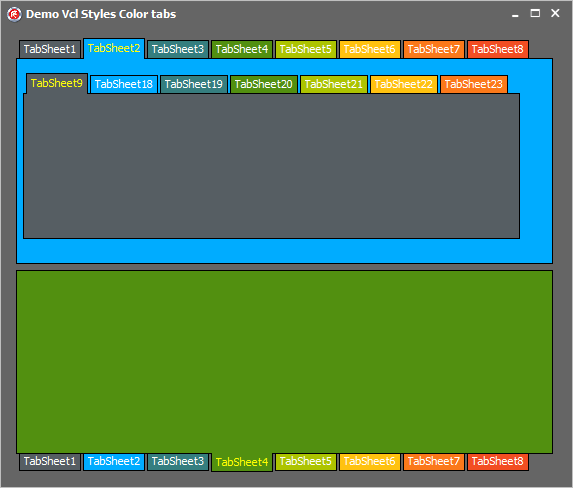
Ok, that was a lot of code, now this is the final result
To use this style hook you must include the Vcl.Styles.ColorTabs unit in your uses class after of the Vcl.ComCtrls unit and then register the hook in this way.
  TCustomStyleEngine.RegisterStyleHook(TCustomTabControl, TTabColorControlStyleHook);
  TCustomStyleEngine.RegisterStyleHook(TTabControl, TTabColorControlStyleHook);
The full source code of this style hook is located in the vcl style utils repository.
VCL Styles – Adding background images and colors to Delphi forms
Adding a background image to a delphi form is a topic very well covered by many articles, but most of them doesn’t work or another produces a lot of flicker when the vcl styles are enabled. The common techniques to set a background image in a form includes :
- Use a TImage component with the align property set to alClient
- Use the OnPaint event of the Form and handle the WM_ERASEBKGND message
- use the Canvas.Brush.Bitmap property of the form to assign a bitmap
- and so on.
Since the introduction of the vcl styles, now you can use the style hooks to handle the paint operations of the TWinControl descendant, the main advantage about the styles hookz is which you can override the core paint methods directly, avoiding the flicker and in most cases you do not even need to handle the windows messages. So now I will how you how you can create a style hook to add a custom background image or color to a form including the non client area.
The first step is create a new Style hook descendant of the TFormStyleHook class and override the PaintNC and PaintBackground methods.
So the class definition will look like this
type
  TFormStyleHookBackround=class(TFormStyleHook)
  strict private
    type
      TSettings = class
      strict private
        FColor: TColor;
        FImageLocation: string;
        FBitmap: TBitmap;
        FUseColor: Boolean;
        FUseImage: Boolean;
        FEnabled: Boolean;
        procedure SetColor(const Value: TColor);
        procedure SetImageLocation(const Value: string);
        procedure SetUseColor(const Value: Boolean);
        procedure SetUseImage(const Value: Boolean);
      public
        property UseImage : Boolean read FUseImage write SetUseImage;
        property UseColor : Boolean read FUseColor write SetUseColor;
        property Color : TColor read FColor write SetColor;
        property ImageLocation : string read FImageLocation write SetImageLocation;
        property Bitmap : TBitmap read FBitmap;
        property Enabled : Boolean read FEnabled write FEnabled;
        constructor Create;
        destructor  Destroy;override;
      end;
    class var FNCSettings: TSettings;
    class var FBackGroundSettings: TSettings;
    class var FMergeImages: boolean;
  protected
    procedure PaintNC(Canvas: TCanvas); override;
    procedure PaintBackground(Canvas: TCanvas); override;
    class constructor Create;
    class destructor  Destroy;
  public
    class property MergeImages: boolean read FMergeImages write FMergeImages;
    class property NCSettings : TSettings read FNCSettings;
    class property BackGroundSettings : TSettings read FBackGroundSettings;
  end;
Note: the above class definition includes some additional elements to store the settings of the style hook like Bitmaps and Colors used.
Painting the background
The PaintBackground method, paints the background of the form filling the control area with the current vcl style background color, in this case we are use a bitmap or a custom color depnding of the setting of the hook.
procedure TFormStyleHookBackround.PaintBackground(Canvas: TCanvas);
var
  LRect   : TRect;
  RBitmap : TRect;
  L,H     : Integer;
begin
  //if the option is not enabled use the default inherited PaintBackground method
  if not BackGroundSettings.Enabled then
   inherited
  else
  begin
    //get he bounds of the control (form)
    LRect := Rect(0, 0, Control.ClientWidth, Control.ClientHeight);
    //use a custom color for the background?
    if  BackGroundSettings.UseColor then
    begin
     Canvas.Brush.Color:=BackGroundSettings.Color;
     Canvas.FillRect(LRect);
    end
    else
    //use a bitmap
    begin
      //check the size of the bitmap against the control bounds to detrine how the bitmap is drawn
      if (BackGroundSettings.Bitmap.Width<LRect.Width) or (BackGroundSettings.Bitmap.Height<LRect.Height) then
      begin
       Canvas.Brush.Bitmap := BackGroundSettings.BitMap;
       Canvas.FillRect(LRect);
      end
      else
      begin
       //check if the the background bitmap must be merged with non client area bitmap
       if not FMergeImages then
        Canvas.CopyRect(LRect,BackGroundSettings.Bitmap.Canvas,LRect)
       else
       begin
        RBitmap:=LRect;
        H:=_GetBorderSize.Top;
        L:=_GetBorderSize.Left;
        RBitmap.SetLocation(L, H);
        Canvas.CopyRect(LRect,BackGroundSettings.Bitmap.Canvas,RBitmap);
       end;
      end;
    end;
  end;
end;
The above code will produce results like these
Using a custom color background
Using a custom image background
Painting the Non client area
To handle the paint operations over the non client area in the old versions of windows (before to windows vista) you must handle the WM_NCPAINT windows message or since Windows Vista using the DWM API you can accomplish this task. But if you uses the vcl styles only you must need override the PaintNC method.
This is the implementation of the PaintNC method to use a custom color or image in the non client area.
procedure TFormStyleHookBackround.PaintNC(Canvas: TCanvas);
var
  LDetail: TThemedWindow;
  LDetails,
  CaptionDetails,
  IconDetails   : TThemedElementDetails;
  R, R1, DrawRect, ButtonRect, TextRect: TRect;
  CaptionBuffer: TBitmap;
  FButtonState: TThemedWindow;
  TextFormat: TTextFormat;
  LText: string;
  SrcBackRect     : TRect;
begin
  //if the setting is not enabled use the original PaintNC method
  if not NCSettings.Enabled then
  begin
   inherited ;
   exit;
  end;

  //check the border style of the form
  if Form.BorderStyle = bsNone then
  begin
    MainMenuBarHookPaint(Canvas);
    Exit;
  end;


  {init some parameters}
  _FCloseButtonRect := Rect(0, 0, 0, 0);
  _FMaxButtonRect := Rect(0, 0, 0, 0);
  _FMinButtonRect := Rect(0, 0, 0, 0);
  _FHelpButtonRect := Rect(0, 0, 0, 0);
  _FSysMenuButtonRect := Rect(0, 0, 0, 0);
  _FCaptionRect := Rect(0, 0, 0, 0);

  if not StyleServices.Available then
    Exit;
  R := _GetBorderSize;

  {draw caption}

  if (Form.BorderStyle <> bsToolWindow) and
     (Form.BorderStyle <> bsSizeToolWin) then
  begin
    if _FFormActive then
      LDetail := twCaptionActive
    else
      LDetail := twCaptionInActive
  end
  else
  begin
   if _FFormActive then
      LDetail := twSmallCaptionActive
    else
      LDetail := twSmallCaptionInActive
  end;
  CaptionBuffer := TBitmap.Create;
  CaptionBuffer.SetSize(_FWidth, R.Top);

  {draw caption border}
  DrawRect := Rect(0, 0, CaptionBuffer.Width, CaptionBuffer.Height);
  LDetails := StyleServices.GetElementDetails(LDetail);  //used for draw text in the caption

  //check if a must use a custom color or a bitmap
  if FNCSettings.UseColor then
  begin
    //use the select color to fill the background of the canvas
    CaptionBuffer.Canvas.Brush.Color:=FNCSettings.Color;
    CaptionBuffer.Canvas.FillRect(DrawRect);
  end
  else
  begin
    //use the bitmap to fill the canvas
    SrcBackRect.Left:=0;
    SrcBackRect.Top:=0;
    SrcBackRect.Width:=DrawRect.Width;
    SrcBackRect.Height:=DrawRect.Height;
    //SrcBackRect.SetLocation(FNCSettings.Bitmap.Width-DrawRect.Width, 0);
    //SrcBackRect.SetLocation(_GetBorderSize.Width, 0);
    CaptionBuffer.Canvas.CopyRect(DrawRect, FNCSettings.Bitmap.Canvas,SrcBackRect);
  end;

  TextRect := DrawRect;
  CaptionDetails := LDetails;

  {draw icon}
  if (biSystemMenu in TCustomFormHack(Form).BorderIcons) and
     (Form.BorderStyle <> bsDialog) and
     (Form.BorderStyle <> bsToolWindow) and
     (Form.BorderStyle <> bsSizeToolWin) then
  begin
    IconDetails := StyleServices.GetElementDetails(twSysButtonNormal);
    if not StyleServices.GetElementContentRect(0, IconDetails, DrawRect, ButtonRect) then
      ButtonRect := Rect(0, 0, 0, 0);
    R1 := Rect(0, 0, GetSystemMetrics(SM_CXSMICON), GetSystemMetrics(SM_CYSMICON));
    RectVCenter(R1, ButtonRect);
    if ButtonRect.Width > 0 then
      DrawIconEx(CaptionBuffer.Canvas.Handle, R1.Left, R1.Top, _GetIconFast.Handle, 0, 0, 0, 0, DI_NORMAL);
    Inc(TextRect.Left, ButtonRect.Width + 5);
    _FSysMenuButtonRect := ButtonRect;
  end
  else
    Inc(TextRect.Left, R.Left);

  {draw buttons}
  if (biSystemMenu in TCustomFormHack(Form).BorderIcons) then
  begin
    if (Form.BorderStyle <> bsToolWindow) and
       (Form.BorderStyle <> bsSizeToolWin) then
    begin
      if (_FPressedButton = HTCLOSE) and (_FHotButton = HTCLOSE) then
        FButtonState := twCloseButtonPushed
      else if _FHotButton = HTCLOSE then
        FButtonState := twCloseButtonHot
      else
        if _FFormActive then
          FButtonState := twCloseButtonNormal
        else
          FButtonState := twCloseButtonDisabled;
     end
    else
    begin
      if (_FPressedButton = HTCLOSE) and (_FHotButton = HTCLOSE) then
        FButtonState := twSmallCloseButtonPushed
      else if _FHotButton = HTCLOSE then
        FButtonState := twSmallCloseButtonHot
      else
        if _FFormActive then
          FButtonState := twSmallCloseButtonNormal
        else
          FButtonState := twSmallCloseButtonDisabled;
    end;

    LDetails := StyleServices.GetElementDetails(FButtonState);
    if not StyleServices.GetElementContentRect(0, LDetails, DrawRect, ButtonRect) then
      ButtonRect := Rect(0, 0, 0, 0);

    StyleServices.DrawElement(CaptionBuffer.Canvas.Handle, LDetails, ButtonRect);

    if ButtonRect.Left > 0 then
      TextRect.Right := ButtonRect.Left;
    _FCloseButtonRect := ButtonRect;
  end;

  if (biMaximize in TCustomFormHack(Form).BorderIcons) and
     (biSystemMenu in TCustomFormHack(Form).BorderIcons) and
     (Form.BorderStyle <> bsDialog) and
     (Form.BorderStyle <> bsToolWindow) and
     (Form.BorderStyle <> bsSizeToolWin) then
  begin
    if Form.WindowState = wsMaximized then
    begin
      if (_FPressedButton = HTMAXBUTTON) and (_FHotButton = HTMAXBUTTON) then
        FButtonState := twRestoreButtonPushed
      else if _FHotButton = HTMAXBUTTON then
        FButtonState := twRestoreButtonHot
      else
      if _FFormActive then
        FButtonState := twRestoreButtonNormal
      else
        FButtonState := twRestoreButtonDisabled;
    end
    else
    begin
      if (_FPressedButton = HTMAXBUTTON) and (_FHotButton = HTMAXBUTTON) then
        FButtonState := twMaxButtonPushed
      else if _FHotButton = HTMAXBUTTON then
        FButtonState := twMaxButtonHot
      else
      if _FFormActive then
        FButtonState := twMaxButtonNormal
      else
        FButtonState := twMaxButtonDisabled;
    end;
    LDetails := StyleServices.GetElementDetails(FButtonState);

    if not StyleServices.GetElementContentRect(0, LDetails, DrawRect, ButtonRect) then
      ButtonRect := Rect(0, 0, 0, 0);
    if ButtonRect.Width > 0 then
      StyleServices.DrawElement(CaptionBuffer.Canvas.Handle, LDetails, ButtonRect);
    if ButtonRect.Left > 0 then
      TextRect.Right := ButtonRect.Left;
    _FMaxButtonRect := ButtonRect;
  end;

  if (biMinimize in TCustomFormHack(Form).BorderIcons) and
     (biSystemMenu in TCustomFormHack(Form).BorderIcons) and
     (Form.BorderStyle <> bsDialog) and
     (Form.BorderStyle <> bsToolWindow) and
     (Form.BorderStyle <> bsSizeToolWin) then
  begin
    if (_FPressedButton = HTMINBUTTON) and (_FHotButton = HTMINBUTTON) then
      FButtonState := twMinButtonPushed
    else if _FHotButton = HTMINBUTTON then
      FButtonState := twMinButtonHot
    else
      if _FFormActive then
        FButtonState := twMinButtonNormal
      else
        FButtonState := twMinButtonDisabled;

    LDetails := StyleServices.GetElementDetails(FButtonState);

    if not StyleServices.GetElementContentRect(0, LDetails, DrawRect, ButtonRect) then
      ButtonRect := Rect(0, 0, 0, 0);
    if ButtonRect.Width > 0 then
      StyleServices.DrawElement(CaptionBuffer.Canvas.Handle, LDetails, ButtonRect);
    if ButtonRect.Left > 0 then TextRect.Right := ButtonRect.Left;
    _FMinButtonRect := ButtonRect;
  end;

  if (biHelp in TCustomFormHack(Form).BorderIcons) and (biSystemMenu in TCustomFormHack(Form).BorderIcons) and
     ((not (biMaximize in TCustomFormHack(Form).BorderIcons) and
     not (biMinimize in TCustomFormHack(Form).BorderIcons)) or (Form.BorderStyle = bsDialog))
  then
  begin
    if (_FPressedButton = HTHELP) and (_FHotButton = HTHELP) then
      FButtonState := twHelpButtonPushed
    else if _FHotButton = HTHELP then
      FButtonState := twHelpButtonHot
    else
    if _FFormActive then
      FButtonState := twHelpButtonNormal
    else
      FButtonState := twHelpButtonDisabled;
    LDetails := StyleServices.GetElementDetails(FButtonState);

    if not StyleServices.GetElementContentRect(0, LDetails, DrawRect, ButtonRect) then
      ButtonRect := Rect(0, 0, 0, 0);
    if ButtonRect.Width > 0 then
      StyleServices.DrawElement(CaptionBuffer.Canvas.Handle, LDetails, ButtonRect);

    if ButtonRect.Left > 0 then
      TextRect.Right := ButtonRect.Left;
    _FHelpButtonRect := ButtonRect;
  end;

  {draw text}
  TextFormat := [tfLeft, tfSingleLine, tfVerticalCenter];
  if Control.UseRightToLeftReading then
    Include(TextFormat, tfRtlReading);

  LText := Text;
  StyleServices.DrawText(CaptionBuffer.Canvas.Handle, CaptionDetails, LText, TextRect, TextFormat);
  _FCaptionRect := TextRect;

  {draw caption buffer}

  Canvas.Draw(0, 0, CaptionBuffer);
  CaptionBuffer.Free;

  {draw menubar}
  MainMenuBarHookPaint(Canvas);

  {draw left border}
  DrawRect := Rect(0, R.Top, R.Left, _FHeight - R.Bottom);
  if DrawRect.Bottom - DrawRect.Top > 0 then
    //use a color?
    if FNCSettings.UseColor then
    begin
      Canvas.Brush.Color:=FNCSettings.Color;
      Canvas.FillRect(DrawRect);
    end
    else
    begin
      if (DrawRect.Height<=FNCSettings.BitMap.Height) and (DrawRect.Width<=FNCSettings.BitMap.Width)  then
        Canvas.CopyRect(DrawRect,FNCSettings.Bitmap.Canvas,DrawRect)
      else
        Canvas.StretchDraw(DrawRect, FNCSettings.BitMap);
    end;

  {draw right border}
  DrawRect := Rect(_FWidth - R.Right, R.Top, _FWidth, _FHeight - R.Bottom);

  if DrawRect.Bottom - DrawRect.Top > 0 then
    //use a color?
    if FNCSettings.UseColor then
    begin
      Canvas.Brush.Color:=FNCSettings.Color;
      Canvas.FillRect(DrawRect);
    end
    else
    begin
      if (DrawRect.Height<=FNCSettings.BitMap.Height) and (Control.Width<=FNCSettings.BitMap.Width)  then
        Canvas.CopyRect(DrawRect,FNCSettings.Bitmap.Canvas,DrawRect)
      else
        Canvas.StretchDraw(DrawRect, FNCSettings.BitMap);
    end;

  {draw Bottom border}
  DrawRect := Rect(0, _FHeight - R.Bottom, _FWidth, _FHeight);

  if DrawRect.Bottom - DrawRect.Top > 0 then
    //use a color?
    if FNCSettings.UseColor then
    begin
      Canvas.Brush.Color:=FNCSettings.Color;
      Canvas.FillRect(DrawRect);
    end
    else
    begin
      if (DrawRect.Height<=FNCSettings.BitMap.Height) and (Control.Width<=FNCSettings.BitMap.Width)  then
        Canvas.CopyRect(DrawRect,FNCSettings.Bitmap.Canvas,DrawRect)
      else
      begin
        SrcBackRect.Left:=0;
        SrcBackRect.Top:=0;
        SrcBackRect.Width:=DrawRect.Width;
        SrcBackRect.Height:=DrawRect.Height;
        SrcBackRect.SetLocation(FNCSettings.BitMap.Width-DrawRect.Width, 0);
        Canvas.CopyRect(DrawRect, FNCSettings.BitMap.Canvas,SrcBackRect);
      end;
    end;
end;
And the result is
Using a custom color in the non client area
Using a custom image in the non client area
Putting it all together
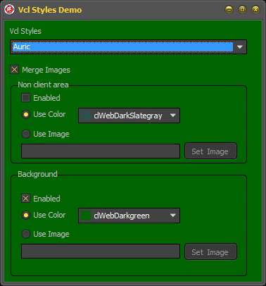
Finally if you mix both methods (the background and the non client area) you can get very nice results
Using the class
The full source code of the TFormStyleHookBackround class is available here and is part of the vcl style utils project. to use it just include a reference to the Vcl.Styles.FormStyleHooks unit in your project and register the style hook like so.
TStyleManager.Engine.RegisterStyleHook(TFrmMain, TFormStyleHookBackround);
To modify the background image of the form, use this code
  TFormStyleHookBackround.BackGroundSettings.UseImage := True;
  TFormStyleHookBackround.BackGroundSettings.ImageLocation := 'image.png'; //set the location of the image
To modify the background color of the form, use this code
  TFormStyleHookBackround.BackGroundSettings.UseColor := True;
  TFormStyleHookBackround.BackGroundSettings.Color := clRed;//set the colot
After of modify background color or image you must repaint the form sending the WM_PAINT message
Check this sample
Var
  LIndex: Integer;
begin
  for LIndex := 0 to ComponentCount - 1 do
    if Components[LIndex] is TWinControl then
    begin
      TWinControl(Components[LIndex]).Invalidate;
      TWinControl(Components[LIndex]).Perform(WM_PAINT, 0, 0);
    end;

  Self.Invalidate;
  Self.Perform(WM_PAINT, 0, 0);
end;
To customize the color of the non client area of the form use this code
  TFormStyleHookBackround.NCSettings.UseColor:= True;
  TFormStyleHookBackround.NCSettings.Color:= clGreen; //set the color
To assign an image to the non client area of the form use this code
  TFormStyleHookBackround.NCSettings.UseImage := True;
  TFormStyleHookBackround.NCSettings.ImageLocation := 'image.png'; //set the location of the image
After of modify color or image of the non client area you must repaint the NC using the WM_NCPAINT message
SendMessage(Handle, WM_NCPAINT, 0, 0);
Download the demo application (binaries) from here.
Delphi VCL Styles and TWebBrowser, source code released.
First I want to thank you, for the great feedback of my last post, all your comments and issue reports were very useful.
Motivation
While I was working on my favorite personal project And I realized which the TWebBrowser embedded in one of my forms doesn’t look very nice when the VCL Styles are enabled. So I decide write a fix.
My main goal was skin the scrollbars of the TWebBrowser component which by default uses the native windows look and feel.
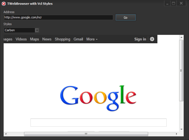
This task involve many challenges like determine which WebBrowser events modify the position and visibility of the scrollbars, get the bounds of the original scrollbars, paint the skinned scrollbars, scroll the WebBrowser control, and so on. So I will try to explain briefly how was done.
The work begin
The first task was hook the TWebBrowser component to check which events and windows messages of the TWebBrowser modify the scrollbars visibility and position. So after of write a little helper application to do this, was determined that the events are :
- OnDocumentComplete
- OnNavigateComplete2
- OnBeforeNavigate2
- OnCommandStateChange
- OnProgressChange
And also the WMSIZE message.
The events
In order to intercept these TWebbrowser events we can’t assign a event handler directly because these will not be fired if the same events are assigned by the user. So the solution was override the InvokeEvent method which is part of the TOleControl control (and which is the parent class of the TWebbrowser component).
Here’s how it looks the overridden InvokeEvent method
procedure TVclStylesWebBrowser.InvokeEvent(DispID: TDispID; var Params: TDispParams);
var
  ArgCount  : Integer;
  LVarArray : Array of OleVariant;
  LIndex    : Integer;
begin
  inherited; //call the original implementation of InvokeEvent
  ArgCount := Params.cArgs;
  SetLength(LVarArray, ArgCount);
  //store the paramaters in an variant array for an more easy access to the values
  for LIndex := Low(LVarArray) to High(LVarArray) do
    LVarArray[High(LVarArray)-LIndex] := OleVariant(TDispParams(Params).rgvarg^[LIndex]);

  //call the private impkemenation of each event
  case DispID of
    252: DoNavigateComplete2(Self,
                              LVarArray[0] {const IDispatch},
                              LVarArray[1] {const OleVariant});

    259: DoDocumentComplete(Self,
                             LVarArray[0] {const IDispatch},
                             LVarArray[1] {const OleVariant});

    250: DoBeforeNavigate2(Self,
                            LVarArray[0] {const IDispatch},
                            LVarArray[1] {const OleVariant},
                            LVarArray[2] {const OleVariant},
                            LVarArray[3] {const OleVariant},
                            LVarArray[4] {const OleVariant},
                            LVarArray[5] {const OleVariant},
                            WordBool((TVarData(LVarArray[6]).VPointer)^) {var WordBool});

    105:DoCommandStateChange(Self,
                               LVarArray[0] {Integer},
                               LVarArray[1] {WordBool});

    108:DoProgressChange(Self,
                           LVarArray[0] {Integer},
                           LVarArray[1] {Integer});

  end;

  SetLength(LVarArray, 0);
end;
Additionally each local event implementation call the ResizeScrollBars method to change the visibility of the scrollbars and calculate the current position
procedure TVclStylesWebBrowser.DoBeforeNavigate2(Sender: TObject; const pDisp: IDispatch; const URL, Flags, TargetFrameName, PostData, Headers: OleVariant; var Cancel: WordBool);
begin
  ResizeScrollBars;
end;

procedure TVclStylesWebBrowser.DoProgressChange(Sender: TObject; Progress,ProgressMax: Integer);
begin
  ResizeScrollBars;
end;

procedure TVclStylesWebBrowser.DoDocumentComplete(Sender: TObject;const pDisp: IDispatch; const URL: OleVariant);
begin
  ResizeScrollBars;
end;

procedure TVclStylesWebBrowser.DoNavigateComplete2(Sender: TObject;const pDisp:IDispatch;const URL: OleVariant);
begin
  ResizeScrollBars;
end;
Also we need to call the same method when the WM_SIZE message arrives.
procedure TVclStylesWebBrowser.WMSIZE(var Message: TWMSIZE);
begin
  inherited;
  ResizeScrollBars;
end;
The Scrollbars
After of that we need to paint the new Scrollbars using two TScrollBar components (Horizontal and Vertical), these controls are not draw directly over the Twebbrowser canvas rather, they are painted over a TWinControl which is a container for these controls, this container overlaps the original (native) scrollbars, also we need implement WMEraseBkgnd message to use the vcl styles color to fill the background of the container.
This is the definition of the private TWinContainer class.
  TVclStylesWebBrowser = class(SHDocVw.TWebBrowser, IDocHostUIHandler, IDocHostShowUI, IOleCommandTarget)
  strict private
    type
      TWinContainer = class(TWinControl)
        procedure WMEraseBkgnd(var Msg: TWMEraseBkgnd); message WM_ERASEBKGND;
      end;
This is the implementation of the WMEraseBkgnd message
procedure TVclStylesWebBrowser.TWinContainer.WMEraseBkgnd(var Msg: TWMEraseBkgnd);
var
  Details: TThemedElementDetails;
  LCanvas: TCanvas;
begin
  LCanvas := TCanvas.Create;
  try
    LCanvas.Handle := Msg.DC;
    Details.Element := teWindow;
    Details.Part := 0;
    StyleServices.DrawElement(LCanvas.Handle, Details, ClientRect);
  finally
    LCanvas.Free;
  end;
end;
And this is the code of how the TScrollBar components are created
constructor TVclStylesWebBrowser.Create(AOwner: TComponent);
begin
  inherited;
  //Get the scrollbars sizes
  LSM_CXHTHUMB:=GetSystemMetrics(SM_CXHTHUMB);
  LSM_CYVTHUMB:=GetSystemMetrics(SM_CYVTHUMB);

  //set the containers to nil
  VScrollBarContainer := nil;
  HScrollBarContainer := nil;

  //create the containers
  ScrollCornerContainer := TWinContainer.Create(Self);
  ScrollCornerContainer.Visible := False;

  //create the vertical scroll bar
  VScrollBarContainer := TWinContainer.Create(Self);
  VScrollBarContainer.Visible := True;
  VScrollBar := TScrollBar.Create(Self);
  VScrollBar.Parent   := VScrollBarContainer;
  VScrollBar.Kind     := sbVertical;
  VScrollBar.Visible  := True;
  VScrollBar.Align    := alClient;
  VScrollBar.OnChange := VScrollChange;
  VScrollBar.Enabled  := False;

  //create the horizontal scroll bar
  HScrollBarContainer := TWinContainer.Create(Self);
  HScrollBarContainer.Visible := False;
  HScrollBar := TScrollBar.Create(Self);
  HScrollBar.Parent   := HScrollBarContainer;
  HScrollBar.Visible  := True;
  HScrollBar.Align    := alClient;
  HScrollBar.OnChange := HScrollChange;
end;
As final step of this stage we need handle CM_VISIBLECHANGED message to hide or show the new scrollbars.
procedure TVclStylesWebBrowser.CMVisibleChanged(var MSg: TMessage);
begin
  inherited ;
  VScrollBarContainer.Visible   := Self.Visible;
  HScrollBarContainer.Visible   := Self.Visible;
  ScrollCornerContainer.Visible := Self.Visible;
end;
The ResizeScrollBars method
As you see in some of the above code a call to the ResizeScrollBars method is made, well this is one of the key points of the TVclStylesWebBrowser class, this method change the visibility , recalculate the sizes of the scrollbars and scroll the TWebBrowser.
Take a look to the method implementation
procedure TVclStylesWebBrowser.ResizeScrollBars;
var
  StateVisible   : Boolean;
  DocClientWidth : Integer;
  ScrollWidth    : Integer;
  ScrollHeight   : Integer;
  HPageSize      : Integer;
  VPageSize      : Integer;
  LRect          : TRect;
  IEHWND         : WinApi.Windows.HWND;
begin
  IEHWND:=GetIEHandle;
  //some safety checks before to continue
  if (IEHWND=0) or (VScrollBarContainer = nil) or (HScrollBarContainer = nil) then Exit;

  if not VScrollBarContainer.Visible then
   VScrollBarContainer.Visible := True;

  //the loaded page has body?
  if (Document <> nil) and (IHtmldocument2(Document).Body <> nil) then
   begin
     //get the client width
     DocClientWidth := OleVariant(Document).documentElement.ClientWidth;
     //if the docuemnt has a width larger than 0
     if (DocClientWidth > 0) then
     begin
       //Get the Scroll Width
       ScrollWidth:=OleVariant(Document).DocumentElement.scrollWidth;
       if (HScrollBar.Max<>ScrollWidth) and (ScrollWidth>=HScrollBar.PageSize) and (ScrollWidth>=HScrollBar.Min) then
         HScrollBar.Max := ScrollWidth;

       //Get the Scroll Height
       ScrollHeight:=OleVariant(Document).DocumentElement.scrollHeight;
       if (VScrollBar.Max<>ScrollHeight) and (ScrollHeight>=VScrollBar.PageSize) and (ScrollHeight>=VScrollBar.Min) then
         VScrollBar.Max := ScrollHeight;
     end
     else
     //use the body values
     begin
       //Get the Scroll Width
       ScrollWidth  := IHtmldocument2(Document).Body.getAttribute('ScrollWidth', 0);
       if (HScrollBar.Max<>ScrollWidth) and (ScrollWidth>=HScrollBar.PageSize) and (ScrollWidth>=HScrollBar.Min) then
         HScrollBar.Max := ScrollWidth;

       //Get the Scroll Height
       ScrollHeight:=IHtmldocument2(Document).Body.getAttribute('ScrollHeight', 0);
       if (VScrollBar.Max<>ScrollHeight) and (ScrollHeight>=VScrollBar.PageSize) and (ScrollHeight>=VScrollBar.Min) then
         VScrollBar.Max := ScrollHeight;
     end;

     //Get the height of the page
     if (HScrollBar.Max > Self.Width - LSM_CXHTHUMB) and(HScrollBar.Max > 0) and (HScrollBar.Max <> Self.Width) then
       VPageSize := Self.Height - LSM_CYVTHUMB
     else
       VPageSize := Self.Height;

     //Set the position of the vertical scrollbar
     VScrollBar.PageSize:=VPageSize;
     VScrollBar.SetParams(VScrollBar.Position, 0, VScrollBar.Max);
     VScrollBar.LargeChange := VScrollBar.PageSize;

     //Set the position of the horizontal scrollbar
     HPageSize := Self.Width - LSM_CXHTHUMB;
     HScrollBar.PageSize:=HPageSize;
     HScrollBar.SetParams(HScrollBar.Position, 0, HScrollBar.Max);
     HScrollBar.LargeChange := HScrollBar.PageSize;

     VScrollBar.Enabled := (VPageSize < VScrollBar.Max) and(VScrollBar.PageSize > 0) and (VScrollBar.Max > 0) and (VScrollBar.Max <> Self.Height);

     StateVisible := HScrollBarContainer.Visible;

     //set the visibility of the containers
     if IsWindow(HScrollBarContainer.Handle) then
      HScrollBarContainer.Visible := (HPageSize < HScrollBar.Max) and (HScrollBar.PageSize < HScrollBar.Max) and (HScrollBar.Max > 0) and (HScrollBar.Max <> Self.Width);
     if not StateVisible and HScrollBarContainer.Visible then
       HScrollBarContainer.BringToFront;
   end;

   UpdateContainers;
end;
Additional elements
Besides of the scrollbars we need to make small changes to the aspect of the TWebBrowser , for example remove the 3D border, this is made via the IDocHostUIHandler interface and the GetHostInfo function.
function TVclStylesWebBrowser.GetHostInfo(var pInfo: TDocHostUIInfo): HRESULT;
var
  BodyCss   : string;
  ColorHtml : string;
  LColor    : TColor;
begin
  LColor:=StyleServices.GetSystemColor(clWindow);
  ColorHtml:= Format('#%.2x%.2x%.2x',[GetRValue(LColor), GetGValue(LColor), GetBValue(LColor)]) ;
  BodyCss:=Format('BODY {background-color:%s}',[ColorHtml]);

  pInfo.cbSize := SizeOf(pInfo);
  pInfo.dwFlags := 0;
  pInfo.dwFlags := pInfo.dwFlags or DOCHOSTUIFLAG_NO3DBORDER;//disable 3d border
  pInfo.dwFlags := pInfo.dwFlags or DOCHOSTUIFLAG_THEME;//use themes
  if FUseVClStyleBackGroundColor then
  pInfo.pchHostCss :=PWideChar(BodyCss); //use the vcl styles color as background color (this optional and disabled by default)
  Result := S_OK;
  ResizeScrollBars;
end;
A Final touch
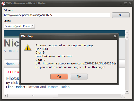
While I was wrote this class I decide add two new options to customize the way how the JScript alert messages and Javascript errors are shown, using the IOleCommandTarget and IDocHostShowUI interfaces.
Implementing the IDocHostShowUI.ShowMessage function you can replace the Windows Internet Explorer message box (which is used for Microsoft JScript alerts among other things).
function TVclStylesWebBrowser.ShowMessage(hwnd: THandle; lpstrText,
  lpstrCaption: POLESTR; dwType: Integer; lpstrHelpFile: POLESTR;
  dwHelpContext: Integer; var plResult: LRESULT): HRESULT;
var
 DlgType: TMsgDlgType;
 Buttons: TMsgDlgButtons;
begin
  Result := E_NOTIMPL;
  if not FCustomizeStdDialogs then exit;

   DlgType:=mtInformation;
  if ((dwType and MB_ICONMASK)=MB_ICONHAND) or ((dwType and MB_ICONMASK)=MB_USERICON) then
   DlgType:=mtCustom
  else
  if (dwType and MB_ICONMASK)=MB_ICONWARNING then
   DlgType:=mtWarning
  else
  if (dwType and MB_ICONMASK)=MB_ICONQUESTION then
   DlgType:=mtConfirmation
  else
  if (dwType and MB_ICONMASK)=MB_ICONEXCLAMATION then
   DlgType:=mtInformation;

  case dwType and MB_TYPEMASK of
    MB_OK:Buttons:=[mbOK];
    MB_OKCANCEL:Buttons:=[mbOK,mbCancel];
    MB_ABORTRETRYIGNORE:Buttons:=[mbAbort,mbRetry,mbIgnore];
    MB_YESNOCANCEL:Buttons:=[mbYes,mbNo,mbCancel];
    MB_YESNO:Buttons:=[mbYes,mbNo];
    MB_RETRYCANCEL:Buttons:=[mbRetry,mbCancel];
  else
    Buttons:=[mbOK];
  end;

  //use the vcl MessageDlg function to show an skinned message box.
  plResult:= MessageDlg(lpstrText, DlgType, Buttons, dwHelpContext);
  Result := S_OK;
end;
Now to customize the message box which shows the javascript errors we must implement the IOleCommandTarget.Exec function (check this article for more info How to handle script errors as a WebBrowser control host)
function TVclStylesWebBrowser.Exec(CmdGroup: PGUID; nCmdID, nCmdexecopt: DWORD;
  const vaIn: OleVariant; var vaOut: OleVariant): HResult;
const
  CGID_DocHostCommandHandler: TGUID = (D1: $F38BC242; D2: $B950; D3: $11D1; D4: ($89, $18, $00, $C0, $4F, $C2, $C8, $36));
var
  LHTMLEventObj : IHTMLEventObj;
  LHTMLWindow2  : IHTMLWindow2;
  LHTMLDocument2: IHTMLDocument2;
  LUnknown      : IUnknown;
  Msg           : string;

  function GetPropertyValue(const PropName: WideString): OleVariant;
  var
    LParams    : TDispParams;
    LDispIDs   : Integer;
    Status     : Integer;
    ExcepInfo  : TExcepInfo;
    LName      : PWideChar;
  begin
    ZeroMemory(@LParams, SizeOf(LParams));
    LName := PWideChar(PropName);
    Status := LHTMLEventObj.GetIDsOfNames(GUID_NULL, @LName, 1, LOCALE_SYSTEM_DEFAULT, @LDispIDs);
    if Status = 0 then
    begin
      Status := LHTMLEventObj.Invoke(LDispIDs, GUID_NULL, LOCALE_SYSTEM_DEFAULT, DISPATCH_PROPERTYGET, LParams, @Result, @ExcepInfo, nil);
      if Status <> 0 then DispatchInvokeError(Status, ExcepInfo);
    end
    else
    if Status = DISP_E_UNKNOWNNAME then raise EOleError.CreateFmt('Property "%s" is not supported.', [PropName])
    else
      OleCheck(Status);
  end;

begin
 Result:=S_OK;
   if (CmdGroup <> nil) and IsEqualGuid(CmdGroup^, CGID_DocHostCommandHandler) then
     case nCmdID of
        //intercept the JScript error messages
        OLECMDID_SHOWSCRIPTERROR:
        begin
          if not FCustomizeJSErrorDialog then exit;
          LUnknown := IUnknown(TVarData(vaIn).VUnknown);
          //get an interface to the document which raise the message
          if Succeeded(LUnknown.QueryInterface(IID_IHTMLDocument2, LHTMLDocument2)) then
          begin
            LHTMLWindow2   := LHTMLDocument2.Get_parentWindow;
            if LHTMLWindow2<>nil then
            begin
              LHTMLEventObj := LHTMLWindow2.Get_event;
              if LHTMLEventObj <> nil then
              begin
               //buil the message to show
               Msg:='An error has ocurred in the script in this page'+sLineBreak+
                    'Line  %s'+sLineBreak+
                    'Char  %s'+sLineBreak+
                    'Error %s'+sLineBreak+
                    'Code  %s'+sLineBreak+
                    'URL   %s'+sLineBreak+
                    'Do you want to continue running scripts on this page?';
               Msg:=Format(Msg,[GetPropertyValue('errorline'), GetPropertyValue('errorCharacter'), GetPropertyValue('errorMessage'), GetPropertyValue('errorCode'), GetPropertyValue('errorUrl')]);
               if MessageDlg(Msg,mtWarning,[mbYes, mbNo],0) =mrYes then
                vaOut := True
               else
                vaOut := False;
               Result:=S_OK;
              end;
            end;
          end;
        end;
     else
        Result:=OLECMDERR_E_NOTSUPPORTED;
     end
   else
     Result:=OLECMDERR_E_UNKNOWNGROUP;
end;
Note : In the end of this entry you can find a very useful collection of resources to customize a WebBrowser control.
How it works?
First the class introduced in this article is not a Vcl Style Hook, because exist some technical limitations to accomplish this, among them is the fact that the TWebBrowser control must implement additional interfaces (IDocHostUIHandler, IDocHostShowUI, IOleCommandTarget), so is necesary modify the original TWebBrowser component.
The recommended way to use the TVclStylesWebBrowser class is add the Vcl.Styles.WebBrowser unit to the uses clause is some point after of the SHDocVw unit and then use an interposer class like so :
TWebBrowser=class(TVclStylesWebBrowser);
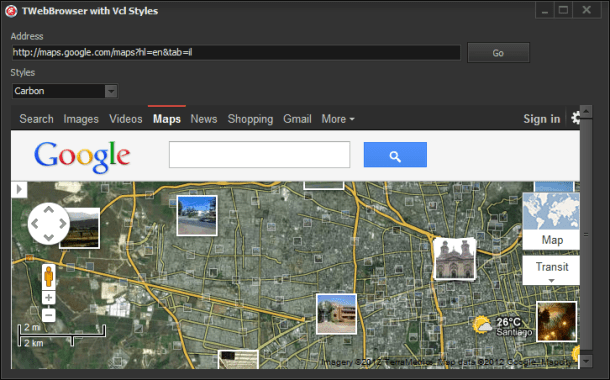
Finally, How it looks?
Source Code
The full source code of this article is part of the VCL Styles Utils project, you can check the Vcl.Styles.WebBrowser unit here
Recommended resources about WebBrowser Customization
- MSDN WebBrowser Customization Part 1
- MSDN WebBrowser Customization Part 2
- How to customize the TWebBrowser user interface
- TEmbeddedWB
- MSDN About Scroll Bars (no related to webbrowser but very useful)
A final words
This is part of an open source project, so feel free to post any issue in the issue page of the project, as well if you want participate improving the code or adding new features, let me now.
VCL Styles and TWebBrowser, Your help is need.
How you probably know the TWebBrowser doesn’t supports the vcl styles, so two days ago I started to write a fix for the TWebBrowser and the VCL styles
So far i’m getting very good results
But I need to do some additional tests in order to release the code, so your help is need it to try the demo app included in this post. Please let me know about any issue which you can find.
Download the demo application from here.
You can send me your feedback to rodrigo dot ruz dot v at gmail dot com
VCL Styles and Owner Draw
UPDATE
A Updated and improved version of the code shown on this article can be found in the Vcl.Styles.OwnerDrawFix unit which is part of the Vcl Styles Utils.
The Issue
When you uses the Vcl Styles, you expect which at least all the standard (and common) controls (TListBox, TEditBox, TListView, TMemo, Treeview, and so on) are skinned according to the style selected, but maybe you are observed some minor issues in controls like TListBox, TListView and TTreeView.
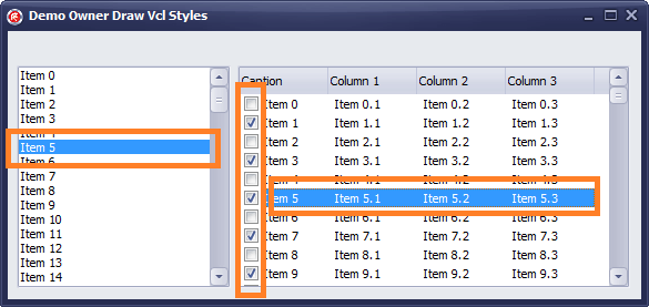
Check the next image, which had a form with a TListBox and a TListView
As you can see the highlight color and the checkboxes doesn’t use the Vcl Styles elements.
The Explanation
So why this happen? is a Vcl Style bug? well let me answer both questions :
First exist basically two ways how the vcl styles skin a control, if the control doesn’t have a windows handle (like the TLabel), the control is draw (usually) in the paint method using the properties and procedures of the StyleServices (TCustomStyleServices) class, otherwise if the control is a TWinControl descendent then use the Style Hooks , the styles hooks handles the windows messages of the controls wrapped by the VCL and use Windows messages and WinApi calls to draw directly over the Canvas of the control or set the properties of the controls (when is possible) like the background or foreground color using the SendMessage function.
In this point the windows messages are the key, some Windows controls doesn’t fire some messages at least which the control was in an owner draw (or Custom Draw) mode.
for example if you want to change the highlight color of a listview
1) You must receive the WM_NOTIFY message
2) then check the NM_CUSTOMDRAW notification code
3) after check for the current drawing stage (CDDS_ITEMPREPAINT in this case)
4) to finally pass a NMLVCUSTOMDRAW record with the new colors to use.
So in this case if the list view has the OwnerDraw property set to false these messages never will sent to our application. Because that is not possible implement a Style hook as there are not windows messages to process.
Note : Is technically possible write a Style hook for receive such owner draw messages, but that will implies create a style hook which need modify the ownerdraw property and then full draw the control.
The Fix
So how the style hooks are discarded, in this case we can owner draw the contols using the Vcl Styles classes and functions. (I don’t spend much time writing these routines , so can be incomplete)
OnDrawItem implementation for a TListbox
procedure TFrmMain.ListBox1DrawItem(Control: TWinControl; Index: Integer; Rect: TRect; State: TOwnerDrawState);
Var
 LListBox : TListBox;
 LStyles  : TCustomStyleServices;
 LDetails : TThemedElementDetails;
begin
  LListBox :=TListBox(Control);
  LStyles  :=StyleServices;
  //check the state
  if odSelected in State then
    LListBox.Brush.Color := LStyles.GetSystemColor(clHighlight);

  //get the details (states and parts) to use
  LDetails := StyleServices.GetElementDetails(tlListItemNormal);

  LListBox.Canvas.FillRect(Rect);
  Rect.Left:=Rect.Left+2;
  //draw the text
  LStyles.DrawText(LListBox.Canvas.Handle, LDetails, LListBox.Items[Index], Rect, [tfLeft, tfSingleLine, tfVerticalCenter]);

  //draw the Highlight rect using the vcl styles colors
  if odFocused In State then
  begin
    LListBox.Canvas.Brush.Color := LStyles.GetSystemColor(clHighlight);
    LListBox.Canvas.DrawFocusRect(Rect);
  end;
end;
OnDrawItem implementation for a TListView
procedure TFrmMain.ListView1DrawItem(Sender: TCustomListView; Item: TListItem;
  Rect: TRect; State: TOwnerDrawState);
var
  r         : TRect;
  rc        : TRect;
  ColIdx    : Integer;
  s         : string;
  LDetails  : TThemedElementDetails;
  LStyles   : TCustomStyleServices;
  BoxSize   : TSize;
  Spacing   : Integer;
  LColor    : TColor;
begin
  Spacing:=4;
  LStyles:=StyleServices;
  //get the color text of the items
  if not LStyles.GetElementColor(LStyles.GetElementDetails(ttItemNormal), ecTextColor, LColor) or  (LColor = clNone) then
  LColor := LStyles.GetSystemColor(clWindowText);

  //get and set the backgroun color
  Sender.Canvas.Brush.Color := LStyles.GetStyleColor(scListView);

  //set the font color
  Sender.Canvas.Font.Color  := LColor;
  Sender.Canvas.FillRect(Rect);

  r := Rect;
  inc(r.Left, Spacing);
  //iterate over the columns
  for ColIdx := 0 to TListView(Sender).Columns.Count - 1 do
  begin
    r.Right := r.Left + Sender.Column[ColIdx].Width;

    if ColIdx > 0 then
      s := Item.SubItems[ColIdx - 1]
    else
    begin
      BoxSize.cx := GetSystemMetrics(SM_CXMENUCHECK);
      BoxSize.cy := GetSystemMetrics(SM_CYMENUCHECK);
      s := Item.Caption;
      if TListView(Sender).Checkboxes then
       r.Left:=r.Left+BoxSize.cx+3;
    end;

    if ColIdx = 0 then
    begin
      if not IsWindowVisible(ListView_GetEditControl(Sender.Handle)) and ([odSelected, odHotLight] * State <> []) then
      begin
        if ([odSelected, odHotLight] * State <> []) then
        begin
          rc:=Rect;
          if TListView(Sender).Checkboxes then
           rc.Left:=rc.Left+BoxSize.cx+Spacing;

          if not TListView(Sender).RowSelect then
           rc.Right:=Sender.Column[0].Width;

          Sender.Canvas.Brush.Color := LStyles.GetSystemColor(clHighlight);
          //draw the highlight rect using the current the vcl styles colors
          Sender.Canvas.FillRect(rc);
        end;
      end;
    end;

    if TListView(Sender).RowSelect then
      Sender.Canvas.Brush.Color := LStyles.GetSystemColor(clHighlight);

    //draw the text of the item
    LDetails := StyleServices.GetElementDetails(tlListItemNormal);
    Sender.Canvas.Brush.Style := bsClear;
    LStyles.DrawText(Sender.Canvas.Handle, LDetails, s, r, [tfLeft, tfSingleLine, tfVerticalCenter, tfEndEllipsis]);

    //draw the check box
    if (ColIdx=0) and TListView(Sender).Checkboxes then
    begin
      rc := Rect;
      rc.Top    := Rect.Top + (Rect.Bottom - Rect.Top - BoxSize.cy) div 2;
      rc.Bottom := rc.Top + BoxSize.cy;
      rc.Left   := rc.Left + Spacing;
      rc.Right  := rc.Left + BoxSize.cx;

      if Item.Checked then
       LDetails := StyleServices.GetElementDetails(tbCheckBoxUncheckedNormal)
      else
       LDetails := StyleServices.GetElementDetails(tbCheckBoxcheckedNormal);

      LStyles.DrawElement(Sender.Canvas.Handle, LDetails, Rc);
    end;

    if ColIdx=0 then
     r.Left:=Sender.Column[ColIdx].Width + Spacing
    else
     inc(r.Left, Sender.Column[ColIdx].Width);
  end;

end;
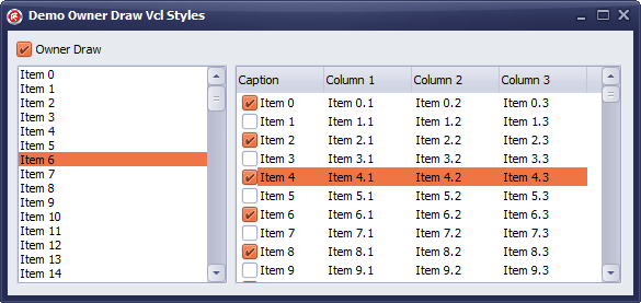
After of apply the above code , this is the result
Check the source of the demo project on Github.
Adding VCL Styles support to a TPopupMenu in 2 lines of code.
UPDATE
This is an old article if you are looking how add vcl styles support to the Menus, dialogs and more try the VCL Styles Utils project.
The TPopupMenu component has not support for Vcl Styles directly, so if you use this control in a form with Vcl Styles enabled you will get a result like this.
To fix this you have 2 ways :
- Write a style hook for a TPopUpMenu (The hard way)
- Or use the TPopupActionBar component (the easy way)
In this post I will show you how use the option 2, taking advantage of two facts
- The TPopupActionBar component has full support for Vcl Styles
- Descends directly from the TPopupMenu component.
So adding the Vcl.ActnPopup unit to your project and using a interposer class (before of the form declaration which contains the PopupMenu), you can add vcl styles to the TPopupMenu component.
uses Vcl.ActnPopup;
type TPopupMenu=class(Vcl.ActnPopup.TPopupActionBar);
This is the result after of add the 2 above lines of code.


