The Road to Delphi

Delphi – Free Pascal – Oxygene


1 Comment

New VCL Styles from DelphiStyles.com

A few days ago KSDev launched a new site, DelphiStyles.com,  this new place offers new FMX and VCL Styles.   I tested the VCL Styles  bundle and are just great,  the themes  looks modern, sleek  and polished.

So if you are looking  for a  professional looking FMX/VCL styles for you application this is the place to go.

Check out the  TOpenDialog component styled using the VCL Style Utils and the  DelphiStyles themes.

Material Black Pearl

Material Oxford Blue

Windows 10 Black Pearl

Windows 10 Oxford Blue

Thanks very much to the guys from DelphiStyle (KSDev) which kindly donated a VCL Styles bundle to The Road to Delphi.

Rodrigo.


5 Comments

TListView OwnerDraw compat with Windows UI & VCL Styles

There is a lot of resources of how ownerdraw a Delphi TListView, but most of them are deprecated and don’t take into account the VCL Styles and the StyleServices.

So on this post I will show you how you can ownerdraw a TListView to be compatible with the native Windows Look and feel and  the VCL Styles.

First,  there is lot of ways  to ownerdraw a TListView , but on this post we will focus only in the OnDrawItem event, because offers more flexibility than the OnCustomDrawXXX events  handlers .

The OnDrawItem is an event handler of type Vcl.ComCtrls.TLVDrawItemEvent

This is the definition of such event

TLVDrawItemEvent = procedure(Sender: TCustomListView;
Item: TListItem; Rect: TRect; State: TOwnerDrawState) of object;

Parameters

  • Sender : The ListView which is raising the event.
  • Item  : The list item which need to be drawn. (you can use this object to read the data of the ListView).
  • Rect : The bounds of the item (including the subitems).
  • State : The current state of item.

Note: Before to use the OnDrawItem event you must set the value of the property TListView.ownerdraw to True.


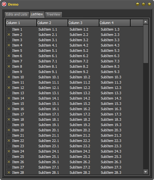
Ok, So I’m planning create a TListview in report mode and draw some controls like a checkbox and progressbar. These controls must looks perfect under the Windows UI and the VCL Styles.

I will start creating the columns of the TListview in runtime (just for personal preference.). I’m using a TDictionary to hold the columns reference in that way I prevent create one variable per column and also I can access the columns by a Name.

procedure TFrmMain.AddColumns;

  Procedure AddColumn(const AColumnName : String; AWidth : Integer; AColumnType : TColumnType);
  begin
   FColumns.Add(AColumnName, LvSampleData.Columns.Add());
   FColumns[AColumnName].Caption := AColumnName;
   FColumns[AColumnName].Width   := AWidth;
   FColumns[AColumnName].Tag     := Integer(AColumnType);
  end;

begin
   FColumns  := TDictionary<string, TListColumn>.Create();
   AddColumn('Text', 150, ctText);
   AddColumn('Porc', 100, ctProgress);
   AddColumn('Text2', 150, ctText);
   AddColumn('Enabled', 100, ctCheck);
end;

Please pay attention to the Tag property of the Columns, I’m using this to store the type of the column (TColumnType is a custom type).

 TColumnType = (ctText, ctCheck, ctProgress);

Next we need fill the listview with some sample data (This doesn’t requires much explanation right?).

const
 MaxItems = 100;
var
 LItem : TListItem;
 i : Integer;
begin
  Randomize;
  LvSampleData.Items.BeginUpdate;
  try
    for i := 0 to MaxItems - 1 do
    begin
      LItem := LvSampleData.Items.Add;
      LItem.Caption:= Format('Sample text', []);
      LItem.SubItems.Add(IntToStr(Random(101)));
      LItem.SubItems.Add(Format('Sample text 2', []));
      LItem.SubItems.Add(IntToStr(Random(2)));
    end;
  finally
    LvSampleData.Items.EndUpdate;
  end;
end;

And now I can start to  draw the TListView items using the the OnDrawItem event.

First I will store a reference to the StyleServices function (In this way I’m avoiding call the same function again and again).

Note  : The StyleServices  method returns an instance of a TCustomStyleServices type, which allow to gain access to all the styling functionality of the current active style (Windows or VCL Style).

Next I will erase any previous content of the current row by filling with the current clWindow color.

Check how the clWindow const is used in the TCustomStyleServices.GetSystemColor function to return the current Window Background color.

procedure TFrmMain.LvSampleDataDrawItem(Sender: TCustomListView; Item: TListItem; Rect: TRect; State: TOwnerDrawState);
...
...
begin
  LStyleService  := StyleServices;
  if not LStyleService.Enabled then exit;

  Sender.Canvas.Brush.Style := bsSolid;
  Sender.Canvas.Brush.Color := LStyleService.GetSystemColor(clWindow);
  Sender.Canvas.FillRect(Rect);

  LRect := Rect;

Now I will iterate over all the columns of the Listview resolving the current column type, the text stored in the current item and calculating the bounds of the current item.

...
...
  for i := 0 to TListView(Sender).Columns.Count - 1 do
  begin
    LColummnType := TColumnType(TListView(Sender).Columns[i].Tag);
    LRect.Right  := LRect.Left + Sender.Column[i].Width;

    LText := '';
    if i = 0 then
      LText := Item.Caption
    else
    if (i - 1) <= Item.SubItems.Count - 1 then
      LText := Item.SubItems[i - 1];
....
....

Note : The OnDrawItem event is raised once per each row of the ListView, So you must draw all the items and subitems yourself).

Now depending of the column type (Text, CheckBox or ProgressBar) I will draw the item.

Text

For the columns of type text (ctText), I check if the State of the item is Selected or Hot and Draw the highlight bar (using the  TCustomStyleServices.DrawElement method) and finally the text is rendered using the TCustomStyleServices.DrawText function.

Check how the color of the text is selected depending of the state of the item.

      ctText:  begin

                  LDetails := LStyleService.GetElementDetails(tgCellNormal);
                  LColor := LStyleService.GetSystemColor(clWindowText);
                  if ([odSelected, odHotLight] * State <> []) then
                  begin
                     LDetails := LStyleService.GetElementDetails(tgCellSelected);
                     LColor := LStyleService.GetSystemColor(clHighlightText);
                     LStyleService.DrawElement(Sender.Canvas.Handle, LDetails, LRect);
                  end;

                  LRect2 := LRect;
                  LRect2.Left := LRect2.Left + ListView_Padding;

                  LTextFormat := TTextFormatFlags(DT_SINGLELINE or DT_VCENTER or DT_LEFT or DT_END_ELLIPSIS);
                  LStyleService.DrawText(Sender.Canvas.Handle, LDetails, LText, LRect2, LTextFormat, LColor);
               end;

CheckBox

For the checkbox columns, the process start in the same way, first check if the item is highlighted and then the bar is drawn.

Then I calculate the bounds of the checkbox and get the text for the column. (for this sample the Value 1 means checked otherwise means unchecked).

Now according to the value and the state of the checkbox is draw.

Please pay attention to how the the element to be drawn is selected depending of the current state and the current text.

      ctCheck: begin
                  if ([odSelected, odHotLight] * State <> []) then
                  begin
                     LDetails := LStyleService.GetElementDetails(tgCellSelected);
                     LStyleService.DrawElement(Sender.Canvas.Handle, LDetails, LRect);
                  end;

                  LSize.cx := GetSystemMetrics(SM_CXMENUCHECK);
                  LSize.cy := GetSystemMetrics(SM_CYMENUCHECK);

                  LRect2.Top    := Rect.Top + (Rect.Bottom - Rect.Top - LSize.cy) div 2;
                  LRect2.Bottom := LRect2.Top + LSize.cy;
                  LRect2.Left   := LRect.Left + ((LRect.Width - LSize.cx) div 2);
                  LRect2.Right  := LRect2.Left + LSize.cx;

                  if (LText = '1') then
                  begin
                    if ([odSelected, odHotLight] * State <> []) then
                      LDetails := LStyleService.GetElementDetails(tbCheckBoxCheckedHot)
                    else
                      LDetails := LStyleService.GetElementDetails(tbCheckBoxCheckedNormal);
                  end
                  else
                  begin
                    if ([odSelected, odHotLight] * State <> []) then
                      LDetails := LStyleService.GetElementDetails(tbCheckBoxUncheckedHot)
                    else
                      LDetails := LStyleService.GetElementDetails(tbCheckBoxUncheckedNormal);
                  end;
                  LStyleService.DrawElement(Sender.Canvas.Handle, LDetails, LRect2);
               end;

ProgressBar

Finally for the progressbar columns, after of check the current state I draw the frame of the progress bar by using the tpBar element, then getting the current value for the column I calculate the bounds of the chunks to be draw. Then depending of the value I fill the progress bar with a solid color or with the element of the current style.

      ctProgress:
               begin
                  if ([odSelected, odHotLight] * State <> []) then
                  begin
                     LDetails := LStyleService.GetElementDetails(tgCellSelected);
                     LStyleService.DrawElement(Sender.Canvas.Handle, LDetails, LRect);
                  end;

                  LRect2   := ResizeRect(LRect, 2, 2, 2, 2);
                  LDetails := LStyleService.GetElementDetails(tpBar);
                  LStyleService.DrawElement(Sender.Canvas.Handle, LDetails, LRect2);

                  if not TryStrToInt(LText, p) then  p := 0;

                  InflateRect(LRect2, -1, -1);
                  LRect2.Right := LRect2.Left + Round(LRect2.Width * p / 100);

                  if p < 20 then
                  begin
                    Sender.Canvas.Brush.Style := bsSolid;
                    Sender.Canvas.Brush.Color := clWebFirebrick;
                    Sender.Canvas.FillRect(LRect2);
                  end
                  else
                  if p < 50 then
                  begin
                    Sender.Canvas.Brush.Style := bsSolid;
                    Sender.Canvas.Brush.Color := clWebGold;
                    Sender.Canvas.FillRect(LRect2);
                  end
                  else
                  begin
                    LDetails := LStyleService.GetElementDetails(tpChunk);
                    LStyleService.DrawElement(Sender.Canvas.Handle, LDetails, LRect2);
                  end;
                end;

This is the final result of the code

Glow

Windows10Dark

WindowsUI

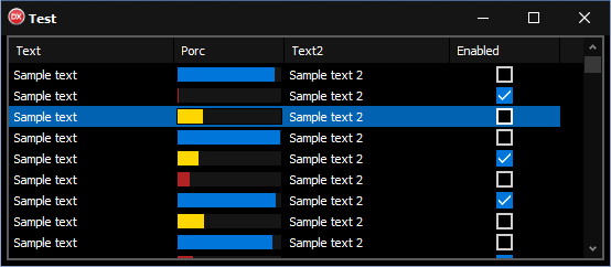
As you can see the list view is draw consistently under Windows or when a custom Style is used.

The full source code is available on Github.


9 Comments

VCL Styles Utils – Now supports the New Common Dialogs

A few moments ago I just made a major commit to the VCL Styles Utils project, Adding support for the New Common Dialogs introduced in Windows Vista. Until now the VCL Styles Utils only was able to hook the older Common Dialogs (Pre-Vista).

3

And from now the modern common dialogs are supported too.

Windows 10 VCL Styles

This new feature was extensively tested on

  • Windows Vista
  • Windows 7
  • Windows 8.1
  • Windows 10 Build 10162 Preview Edition

Important Note : The Windows Classic Theme is not supported.


This slideshow requires JavaScript.


All your feedback is very welcome, remember which you can report issues and make suggestions using the issue page of the project.

Rodrigo.


5 Comments

VCL Styles Utils and NonClient Area – New features

I just added a set of new features to the VCL Styles Utils project

New NC Buttons styles

Two new styles was added to the TNCButton control (nsAlpha and nsGradient). So now you can add Alpha-blended and Gradient buttons to the title bar of the Forms.

NC_AlphaGradient

To add a button in the NC Area, only you need add a TNCControls component to your form and then insert a TNCButton in the collection like so.

  NCControls:=TNCControls.Create(Self);
  NCControls.Add(TNCButton.Create(NCControls));
  NCControls[0].Style       := nsAlpha;
  NCControls[0].ImageStyle  := isNormal;
  NCControls[0].Images      := ImageList1;
  NCControls[0].ImageIndex  := 0;
  NCControls[0].BoundsRect  := Rect(30, 1, 120, 26);
  NCControls[0].Caption     := 'nsAlpha1';
  NCControls[0].Name        := 'nsAlpha1';
  NCControls[0].AlphaColor   := clWebLavender;
  NCControls[0].AlphaHotColor:= clWebAliceBlue;
  NCControls[0].FontColor   := clWhite;
  NCControls[0].HotFontColor:= clYellow;
  NCControls[0].OnClick     := ButtonNCClick;

Support for Custom VCL Styles in the NonClient Area

The TNCControls component was updated to support a different custom VCL Style in the NC Area. Check these screenshots with the glow style (this is the application VCL Style) in the body of the form and a custom VCL Style in the NC Area.

This slideshow requires JavaScript.

To activate a custom style in the NC Area, only you need add a TNCControls component to your form and set the StyleServices property

  NCControls:=TNCControls.Create(Self);
  NCControls.StyleServices := TStyleManager.Style['Sky']; //Set the Sky vcl style to be used to draw the NC Area of the form

You can check the sample application here.


20 Comments

VCL Styles Utils – Major Update (Dialogs, ProgressBar, DateTimePicker, ListView and more)

A Major updated was made to the VCL Styles Utils project. This version include several fixes and new features.

Vcl.Styles.Hooks

The Vcl.Styles.Hooks unit is the most updated part of this new release. This unit is the responsible of hook some of the UxTheme and WinApi methods like DrawThemeBackground, GetSysColor and GetSysColorBrush. Which allows take the control of the painting process for the system themed (and owner-draw) controls.

ListView

This new release fix the highlight color used on the selected items and also replace the themed checkBox by a styled checkbox.

ListView with VCL Styles
2014-11-04 11_08_19-Demo

ListView with VCL Styles + Vcl.Styles.Hooks unit
2014-11-04 11_08_55-Demo

Also was added support for style the Listview groups.

ListView with VCL Styles

2014-11-04 11_11_23-Demo

ListView with VCL Styles + Vcl.Styles.Hooks unit

2014-11-04 11_12_45-Demo

DateTime Controls

The Styling of the TMonthCalendar and TDatetimepicker components is one of the limitations of the VCL Styles, because such components are owner-draw by the system and doesn’t allow to customize the look and feel when the native themes are enabled (for more information read these TMonthCalendar and TDatetimepicker ) also only the newest versions of Delphi includes a partial styling support for such components. With this new release the styling of these controls is now possible.

TDateTimePicker and TMonthCalendar with VCL Styles

2014-11-04 11_29_24-Demo - RAD Studio XE7 - uMain [Running] [Built]

TDateTimePicker and TMonthCalendar with VCL Styles + Vcl.Styles.Hooks unit

2014-11-04 11_54_31-Demo - Embarcadero RAD Studio XE2 - Vcl.Styles.Hooks [Running] [Built]

ProgressBar

Improved support for the TProgressbar component without flicker and with Marquee style.

2014-11-04 14_48_10-Demo

Select Directory Dialog

The styling for the select directory dialog was enhanced adding support for the open and close glyphs and fixing the color of the highlight bar.

VCL Styles Utils

2014-11-04 15_01_14-Browse For Folder

VCL Styles Utils + Vcl.Styles.Hooks unit

2014-11-04 15_01_52-Greenshot

Open/Save Dialog

The VCL Styles support of the Open and Save dialogs was improved adding styling for groups and highlight items. Also a fix for the select folder combobox was introduced.

VCL Styles Utils

2014-11-04 15_12_50-Open

2014-11-04 15_20_49-Open

2014-11-04 15_26_07-ThemedSysControls - Embarcadero RAD Studio XE2 - ThemedSysControls.dproj [Runnin

VCL Styles Utils + Vcl.Styles.Hooks unit

2014-11-04 15_14_27-Open

2014-11-04 15_21_25-Open

2014-11-04 15_25_16-Edit Post ‹ The Road to Delphi - a Blog about programming — WordPress


7 Comments

VCL Styles Utils – Now supports the TTaskDialog component

I’m very pleased to introduce a very exciting new feature to the VCL Styles Utils project. This is the support for style the TTaskDialog component and all the TaskDialog based Message dialogs. This control available since RAD Studio 2007 is a wrapper for the Task Dialogs introduced in Windows Vista and allows to create very rich and flexible dialogs.

Take a look to some sample dialogs.

2014-10-09 09_48_43-VCL Styles Utils - TTaskDialogs Demo

2014-10-09 09_41_40-VCL Styles Utils - TTaskDialogs Demo

2014-10-09 09_42_31-Greenshot

2014-10-09 09_47_41-VCL Styles Utils - TTaskDialogs Demo

2014-10-09 09_47_52-VCL Styles Utils - TTaskDialogs Demo

2014-10-09 09_48_07-VCL Styles Utils - TTaskDialogs Demo

2014-10-09 09_48_19-VCL Styles Utils - TTaskDialogs Demo

2014-10-09 09_48_31-VCL Styles Utils - TTaskDialogs Demo

And now enabling the VCL Styles and just adding the Vcl.Styles.Hooks unit to your project…..

2014-10-09 09_57_33-VCL Styles Utils - TTaskDialogs Demo

2014-10-09 09_58_01-VCL Styles Utils - TTaskDialogs Demo

2014-10-09 09_58_28-VCL Styles Utils - TTaskDialogs Demo

2014-10-09 09_58_55-VCL Styles Utils - TTaskDialogs Demo

2014-10-09 09_52_55-VCL Styles Utils - TTaskDialogs Demo

2014-10-09 09_54_40-VCL Styles Utils - TTaskDialogs Demo

2014-10-09 09_55_11-VCL Styles Utils - TTaskDialogs Demo

2014-10-09 09_55_40-VCL Styles Utils - TTaskDialogs Demo

2014-10-09 09_56_04-VCL Styles Utils - TTaskDialogs Demo

2014-10-09 09_56_42-VCL Styles Utils - TTaskDialogs Demo

You can download a sample application from the project repository.
Also a compiled demo is available here.

If you found any bug please use the issue page of the project.

For a quick tutorial of how use the TTaskDialog component check this great Inofficial TTaskDialog Documentation.

Rodrigo.


4 Comments

VCL Styles Utils – New Feature : Non Client Area Controls

I’m very pleased to introduce a very cool new feature to the VCL Styles Utils project. This is the support for controls in the Non Client Area of the forms through the TNCControls component.

Check the next form with the Auric Vcl Style applied.

1

Now the same form but with a set of NC Buttons in the title bar.

2

To use in your forms you only need to add the Vcl.Styles.NC and Vcl.Styles.FormStyleHooks units to your project and create a TNCControls component in each form where do you want use the NC Controls.

Check the next sample code

procedure TForm1.FormCreate(Sender: TObject);
begin
 NCControls:=TNCControls.Create(Self);
 //Add a NC Button
 NCControls.List.Add(TNCButton.Create(NCControls));
 //Set the style of the button
 NCControls.List[0].Style := nsSplitButton;
 //Set the style of the image
 NCControls.List[0].ImageStyle := isGrayHot;
 //Set the image list
 NCControls.List[0].Images := ImageList1;
 NCControls.List[0].ImageIndex := 3;
 //Set the bounds
 NCControls.List[0].BoundsRect := Rect(30,5,100,25);
 NCControls.List[0].Caption := 'Menu';
 //Assign the menu and events.
 NCControls.List[0].DropDownMenu:= PopupMenu1;
 NCControls.List[0].OnClick := ButtonNCClick;
end;

And this is the result

4

Screenshots

3

Exist 4 kind of buttons which you can choose.
5

Also you can use a custom Vcl Style to draw the controls.
6

Try the sample application from the project repository.
Also you can download a compiled demo from here.

Remember report any bug o made your suggestions via the issue page of the project.


7 Comments

A new way to select and apply a VCL Style in Runtime

Typically we use a combobox or listbox to allow to the final user select and appy a VCL Style, Today I will show you a new way using the system menu of the form.

First you need to use the GetSystemMenu WinApi function  to get a  handle to the system menu of the form. Then using the AppendMenu or the InsertMenuItem methods you can customize the system menu, from here you must store the identifier of the new menu item added and finally process the WM_SYSCOMMAND message to launch an action.

Check the next commented code

uses
  System.Rtti,
  System.Classes,
  System.Generics.Collections,
  WinApi.Windows,
  WinApi.Messages,
  Vcl.Themes,
  Vcl.Styles,
  Vcl.Forms;

type
  TMethodInfo=class;

  TProcCallback = reference to procedure(Info : TMethodInfo);
  TMethodInfo=class
   Value1 : TValue;
   Value2 : TValue;
   Method : TProcCallback;
  end;
  TVclStylesSystemMenu=class(TComponent)
  strict private
    FVCLStylesMenu : HMenu;
    FOrgWndProc: TWndMethod;
    FForm : TForm;
    FMethodsDict : TObjectDictionary&lt;NativeUInt, TMethodInfo&gt;;
    procedure CreateMenus;
    procedure DeleteMenus;
    procedure CreateMenuStyles;
    procedure WndProc(var Message: TMessage);
  public
    constructor Create(AOwner: TForm); reintroduce;
    destructor Destroy; override;
  end;

implementation

uses
  Vcl.Controls,
  System.SysUtils;

const
 VCLStylesMenu=WM_USER + 666;

//Add a new Menu Item
function InsertMenuHelper(hMenu: HMENU; uPosition: UINT; uIDNewItem: UINT_PTR; lpNewItem, IconName: LPCWSTR) : BOOL;
var
  LMenuItem : TMenuItemInfo;
begin
  ZeroMemory(@LMenuItem, SizeOf(TMenuItemInfo));
  LMenuItem.cbSize := SizeOf(TMenuItemInfo);
  LMenuItem.fMask  := MIIM_FTYPE or MIIM_ID or MIIM_BITMAP or MIIM_STRING;
  LMenuItem.fType  := MFT_STRING;
  LMenuItem.wID    := uIDNewItem;
  LMenuItem.dwTypeData := lpNewItem;
  Result:=InsertMenuItem(hMenu, uPosition, True, LMenuItem);
end;

//Add a new separator
procedure AddMenuSeparatorHelper(hMenu : HMENU; var MenuIndex : Integer);
var
  LMenuInfo    : TMenuItemInfo;
  Buffer       : array [0..79] of char;
begin
  ZeroMemory(@LMenuInfo, SizeOf(TMenuItemInfo));
  LMenuInfo.cbSize := sizeof(LMenuInfo);
  LMenuInfo.fMask  := MIIM_TYPE;
  LMenuInfo.dwTypeData := Buffer;
  LMenuInfo.cch := SizeOf(Buffer);
  if GetMenuItemInfo(hMenu, MenuIndex-1, True, LMenuInfo) then
  begin
    if (LMenuInfo.fType and MFT_SEPARATOR) = MFT_SEPARATOR then
    else
    begin
      InsertMenu(hMenu, MenuIndex, MF_BYPOSITION or MF_SEPARATOR, 0, nil);
      inc(MenuIndex);
    end;
  end;
end;

{ TVclStylesSystemMenu }

constructor TVclStylesSystemMenu.Create(AOwner: TForm);
begin
  inherited Create(AOwner);
  //Get an instance to the form
  FForm:=AOwner;
  //Init the collection to store the menu ids and callbacks
  FMethodsDict:=TObjectDictionary&lt;NativeUInt, TMethodInfo&gt;.Create([doOwnsValues]);
  //store the original WndProc
  FOrgWndProc := FForm.WindowProc;
  //replace the WndProc of the form 
  FForm.WindowProc := WndProc;
  //Modify the system menu
  CreateMenus;
end;

destructor TVclStylesSystemMenu.Destroy;
begin
  DeleteMenus;
  FForm.WindowProc := FOrgWndProc;
  FMethodsDict.Free;
  inherited;
end;

procedure TVclStylesSystemMenu.CreateMenus;
begin
  CreateMenuStyles;
end;

procedure TVclStylesSystemMenu.DeleteMenus;
begin
   if IsMenu(FVCLStylesMenu) then
   while GetMenuItemCount(FVCLStylesMenu)&gt;0 do
     DeleteMenu(FVCLStylesMenu, 0, MF_BYPOSITION);

   FMethodsDict.Clear;
end;

procedure TVclStylesSystemMenu.CreateMenuStyles;
var
 LSysMenu : HMenu;
 LMenuItem: TMenuItemInfo;
 s : string;
 uIDNewItem, LSubMenuIndex : Integer;
 LMethodInfo : TMethodInfo;
begin
  LSysMenu := GetSystemMenu(FForm.Handle, False);

  LSubMenuIndex:=GetMenuItemCount(LSysMenu);
  AddMenuSeparatorHelper(LSysMenu,  LSubMenuIndex);

  FVCLStylesMenu   := CreatePopupMenu();
  s:='VCL Styles';

  uIDNewItem := VCLStylesMenu;
  ZeroMemory(@LMenuItem, SizeOf(TMenuItemInfo));
  LMenuItem.cbSize := SizeOf(TMenuItemInfo);
  LMenuItem.fMask  := MIIM_SUBMENU or MIIM_FTYPE or  MIIM_ID or MIIM_BITMAP or MIIM_STRING;
  LMenuItem.fType  := MFT_STRING;
  LMenuItem.wID    := VCLStylesMenu;
  LMenuItem.hSubMenu := FVCLStylesMenu;
  LMenuItem.dwTypeData := PWideChar(s);
  LMenuItem.cch := Length(s);
  //Add the new menu item to the system menu
  InsertMenuItem(LSysMenu, GetMenuItemCount(LSysMenu), True, LMenuItem);
  inc(uIDNewItem);
  LSubMenuIndex:=0;

  //Iterate over the registered styles and create a new menu entry for each style 
  for s in TStyleManager.StyleNames do
  begin
    InsertMenuHelper(FVCLStylesMenu, LSubMenuIndex, uIDNewItem,  PChar(s), nil);
    if SameText(TStyleManager.ActiveStyle.Name, s) then
      CheckMenuItem(FVCLStylesMenu, LSubMenuIndex, MF_BYPOSITION or MF_CHECKED);
    inc(LSubMenuIndex);
    inc(uIDNewItem);
    LMethodInfo:=TMethodInfo.Create;
    LMethodInfo.Value1:=s;
    //set the method to execute when the item is clicked
    LMethodInfo.Method:=procedure(Info : TMethodInfo)
                        begin
                          TStyleManager.SetStyle(Info.Value1.AsString);
                        end;
    //register the menu id and the callback function.
    FMethodsDict.Add(uIDNewItem-1, LMethodInfo);
  end;
end;

procedure TVclStylesSystemMenu.WndProc(var Message: TMessage);
var
  LVerb : NativeUInt;
begin
  case Message.Msg of
    //Detect when the window handle is recreated
    CM_RECREATEWND: begin
                      DeleteMenus;
                      FOrgWndProc(Message);
                      CreateMenus;
                    end;
    //Track the system menu calls
    WM_SYSCOMMAND : begin
                     if FMethodsDict.ContainsKey(TWMSysCommand(Message).CmdType) then
                     begin
                      LVerb:=TWMSysCommand(Message).CmdType;
                      FMethodsDict.Items[LVerb].Method(FMethodsDict.Items[LVerb]);
                     end
                     else
                      FOrgWndProc(Message);
                    end
  else
    FOrgWndProc(Message);
  end;
end;

end.

And this the result

Windows

Amakritz

Cobalt

To use this class, only you need create an new instance passing a reference to the form.

procedure TForm1.FormCreate(Sender: TObject);
begin
  TVclStylesSystemMenu.Create(Self);
end;

You can check the full source code here.


2 Comments

VCL Styles Utils – New feature

I just uploaded a new release of the VCL Styles Utils project improving the support for ListViews and TreeView controls. When you uses a TListView setting the CheckBoxes property to True and with the VCL Styles enabled the control will look like so

ListView_NoHook

As you can see the Checkboxes is using the Windows native look and feel, this is because the OS draw these controls directly and not the VCL. Some time ago I show a workaround for this owner-drawing the TListView, unfortunately this implies modify the source code for each TListView in the project which means a lot of work in some scenarios. But now with this new addition to the VCL Styles Utils only adding the VCL.Styles.Hooks unit to your project the checkbox control is properly drawn using the current active VCL Style.

ListView_Hook

The same improvement goes for the TTreeview controls, by default the opened and closed glyphs are draw using the native look and feel

TreeView_NoHook

And now using the VCL.Styles.Hooks unit

TreeView_Hook

Remember which this unit also include a fix for the system colors when the VCL Styles are enabled as is show on this article.

Without Vcl.Styles.Hooks

List_Hook

With Vcl.Styles.Hooks

List_Hook

Note : The VCL.Styles.Hooks unit works hooking the UxTheme dll, this means which using this unit on your project will cause which all the calls to the DrawThemeBackground and DrawThemeBackgroundEx methods with the BP_RADIOBUTTON, BP_CHECKBOX, TVP_GLYPH, TVP_HOTGLYPH parts will be affected.


13 Comments

VCL Styles Utils, Embarcadero Agreement and Delphi XE6

Embarcadero Agreement

As probably you know, a small part of the VCL Styles utils project was licensed to Embarcadero, via a non-exclusive proprietary license. This means which they can use, modify and distribute the code as part of the VCL, but the Copyright and the Open Source version of the project still belong us. So you can continue using this library in all the Delphi versions supported (XE2-XE6).

Delphi XE6

The VCL Styles utils was updated to support and avoid conflicts with Delphi XE6. Check the next image which show the Open Dialog styled using the New XE6 style Table Dark

Tabla_Dark_Open

Since now the main difference is that you can use the menu style hook which is included as part of the Delphi XE6 VCL Styles, or continue using the menu hook of the library, this is described in the Vcl.Styles.Utils.Menus unit.

{$DEFINE UseVCLStyleUtilsMenu}
{$IF CompilerVersion >= 27} // Use the XE6 menu syshooks by default
  {$UNDEF UseVCLStyleUtilsMenu} // comment this line if you want to use the VCL Styles Utils Menus Hooks instead
{$IFEND}

About the Styled Dialogs

Using the library is the only way to style the system dialogs, currently we support all the Common Dialog Box Types (Color, Find, Font, Open, Page Setup, Print, Replace, Save As).

Check the Common Dialogs styled using the Premium VCL Style Jet.

Jet

But not just the Common dialogs are styled, in fact any dialog (#32770 Class) which uses the windows common controls is supported (of course if the dialog had a owner draw control this cannot be styled). For an example take a look to the next images.

Prompt DataSource Dialog

output_sWoRA1

Select User Dialog

ObjectSelect_4

Note: Some dialogs cannot be styled, because uses the undocumented DirectUIHWND control, these include the new (introduced in windows Vista) Open and Save As dialog and the Task Dialogs

Rodrigo.